
Algos Serif
Date:2020
For: Typeface Design (YSDN Year 3)
Brief: Create a typeface that reflects your voice.
My Direction: I had an idea to create a stackable typeface for a while, but I didn’t have the technical knowledge to make it happen. Really I was curious about what it might be like if a typeface was inherently modifiable in ways other than weight and width. I was trying to explore the line between formal type design and experimental typography. The typeface itself needs work, but I found an interesting new range of possibilities from this exploration.
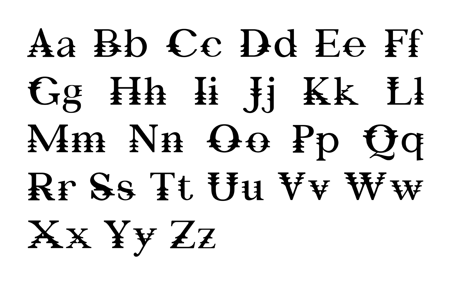
The height of the variations is determined on fractions of the total x-height. The capital characters are also reduced by fractions of the x-height to maintain the proportion to the lowercase characters.
The x-height is 70% of the cap height so the height of the shorter variations is still reasonably tall to retain some readability.

In Action
Since I saw the signs in the cafeteria of the Union Go station, I had the idea of making live posters that could use similar technology to make advertising spaces more active.
The poster on the left is for an exhibition at the Museum of Contemporary Art Montreal (MCM), specifically made to test out the accented glyphs.
The poster on the right was intended to be a slow blending from the first to last poster in the series of Van Gogh posters for the Van Gogh Museum in Amsterdam. The idea was to have a live poster that wasn’t overly active (like the MCM poster).


